I Thought Splitting Facebook Messenger Was a UX Mistake in 2014. Was It?
There is an article I meant to write more than a decade ago.
In 2014, Facebook made what at the time felt like a strangely user-hostile decision: it removed messaging from its primary Facebook apps on Android and iPhone and started requiring users to install the standalone Facebook Messenger app instead.
I remember thinking: why do I need two apps to use what was previously one service?
Facebook apparently disagreed.
Twelve years later, there is something slightly amusing about revisiting that reaction. On Android today, I often find myself doing exactly what Facebook stopped me doing in 2014: using Facebook itself for messaging when possible.
One reason is very mundane.
Storage.
If I already have Facebook installed, I don't necessarily want another large social-media application sitting beside it, accumulating its own application data, caches, images, videos and other media.
So was Facebook right to split Messenger out?
From a product and engineering perspective, there were good reasons.
From a user-experience perspective, I'm still not convinced that taking the choice away from users was one of them.
First, what actually happened?
Facebook Messenger was not created in 2014.
The standalone Messenger application originally launched in 2011, as Facebook later noted in its 500-million-user announcement.
For several years, however, installing it was effectively optional. Facebook's main Android and iOS apps still contained their own Messages functionality.
You could open Facebook, read your News Feed, look at somebody's profile and then message them without leaving the application.
That began changing in earnest in April 2014.
Facebook started notifying some European Android and iOS users that messaging would soon stop working inside the main Facebook app. Those users would instead need Messenger.
Then, on 28 July 2014, Facebook confirmed that the migration would expand worldwide. The Messages button in the main Facebook app would effectively become a shortcut that switched the user into Messenger rather than opening an inbox inside Facebook.
Contemporary reporting documented the April rollout and July expansion.
So the controversial change I remember was very much a 2014 change, although its effects and Messenger's rapid expansion continued through 2015.
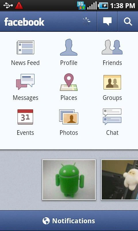
Before the split: an older Facebook Android interface shows Messages and Chat within the main app. Historical screenshot supplied for this retrospective; not presented as a screenshot from the precise 2014 rollout.
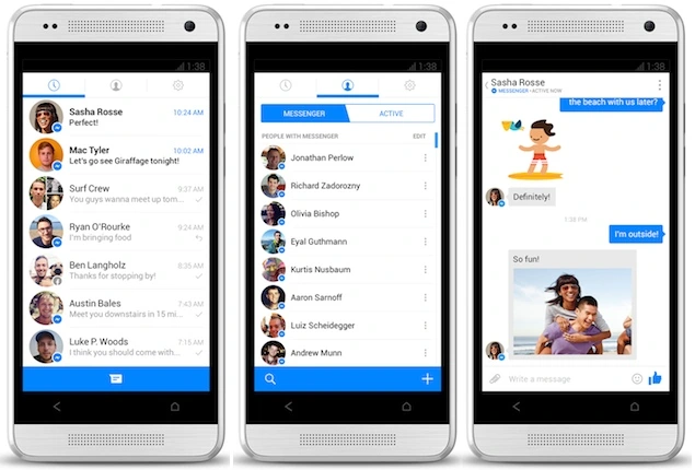
The standalone Android Messenger design from the 2013 redesign era. Screenshot supplied for this article. Facebook's announcement.
Why Facebook did it
Facebook's reasoning was not completely irrational.
In fact, from Facebook's perspective it was fairly coherent.
The company believed messaging was becoming too important to remain another tab buried inside an increasingly complicated Facebook application.
A dedicated application could put conversations directly in front of the user, instead of behind the main Facebook navigation.
Facebook also had usage data supporting its argument.
When it expanded the Messenger requirement worldwide in July 2014, Facebook said users of Messenger replied roughly 20% faster. It also argued that maintaining two implementations of mobile chat, one inside Facebook and another inside Messenger, fragmented development effort.
There was a broader strategy at work too.
Facebook was experimenting heavily with the idea of unbundling the "big blue app".
Instead of one enormous Facebook application containing everything, individual activities could become focused mobile products.
Messenger for communication.
Paper for content consumption.
Facebook's Camera experiment had previously tried something similar with photography.
At the time, the mobile software industry was also fascinated by highly focused applications that did one thing particularly well.
A Swiss Army knife application was not necessarily considered good mobile product design.
And Facebook certainly had a Swiss Army knife.
From a pure UI perspective, Messenger was arguably better
This is where my criticism needs some nuance.
The standalone Messenger application was not inherently bad.
Quite the opposite.
By late 2013 and 2014 it had a much cleaner interface than messaging buried inside Facebook.
Instead of carrying Facebook's entire navigation hierarchy around, Messenger could dedicate practically the whole screen to conversations.
Recent conversations were immediately visible.
Contacts were easier to reach.
Photos, stickers and eventually video could be surfaced directly in the composer.
Messenger could also load into a conversation without first loading the entire Facebook experience.
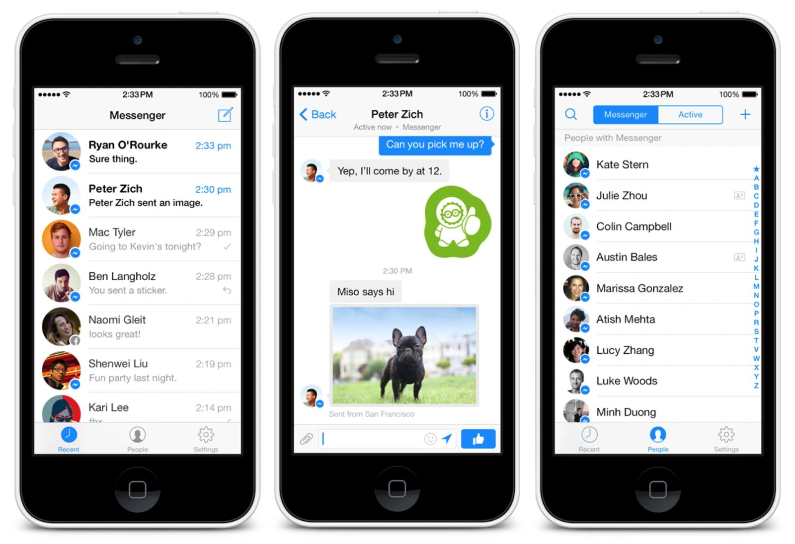
Facebook's Messenger team deliberately distanced its visual identity from Facebook itself. The heavy Facebook-blue chrome was reduced, navigation was simplified and the product increasingly looked like a messaging application rather than a Facebook webpage squeezed onto a phone.
Early standalone Messenger on iOS. The supplied screenshot illustrates its conversation-first design, rather than the current interface.
And during 2014 and 2015, the separation gave Facebook space to move very quickly.
Messenger's capabilities expanded across this period, including video calling in April 2015. That announcement also referenced payments and Messenger Platform, showing how far the product had moved beyond a basic inbox.
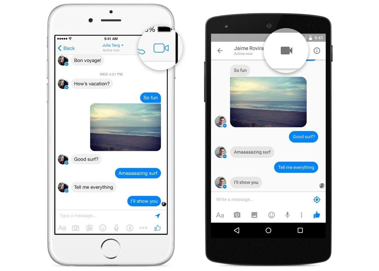
Messenger's 2015 video-calling interface on iOS and Android. Screenshot supplied for this article; Facebook's launch announcement.
In that respect, the strategy clearly worked.
Messenger stopped being "the Facebook Messages screen" and became an independent communications platform.
But good UI does not automatically mean good UX
This distinction is why I disliked the change.
The UI of Messenger could be better while the overall UX became worse for some users.
Before the split, my mental model was straightforward:
Facebook → friend → message them.
Afterwards it became:
Facebook → friend → tap Message → switch applications → Messenger → conversation.
The individual screens could be faster.
The typography could be cleaner.
The chat interface could be more focused.
But there was now an application boundary in the middle of a previously continuous interaction.
And that boundary came with costs.
- Another installation.
- Another icon.
- Another set of notifications.
- Another application to update.
- Another application consuming storage.
And another application potentially competing for resources on phones which, in 2014 especially, often had considerably less RAM and storage than today's devices.
What had previously been a feature became an application dependency.
That is not automatically a UX improvement.
The missing ingredient was choice
This remains the part of Facebook's decision that I think aged least gracefully.
Facebook did not merely build a better standalone messaging application.
It removed the alternative.
If Messenger really offered a superior experience, users could have been encouraged to install it.
Power users and heavy chat users probably would have done so voluntarily.
Facebook could have offered both:
- Light or occasional messaging? Use the inbox built into Facebook.
- Heavy Messenger user? Install the dedicated application for the richer and faster experience.
Instead, Facebook effectively decided that maintaining both experiences wasn't worth it and transferred that complexity to the user.
That is an understandable engineering decision.
It isn't necessarily a user-centred one.
App storage became more important than I expected
This part is especially interesting to me looking back from 2026.
One of the mundane advantages of keeping messaging inside Facebook is simply that I can avoid maintaining another application on my Android phone.
Applications don't occupy only their original download size.
They accumulate data.
They cache temporary resources.
If you consume lots of photos, video, Stories and other media, application storage can grow considerably over time.
Android distinguishes cache from stored application data, and Google explains the controls for clearing them when reclaiming storage.
iOS faces the same basic problem from a user's perspective: Apple exposes per-app storage consumption and provides an Offload App option specifically to reclaim an application's own storage while retaining its documents and data.
The exact storage cost depends on the device, app versions and usage. I am not claiming a fixed saving or that the two apps duplicate every byte.
Having Facebook and Messenger therefore isn't simply about having two icons.
It means maintaining two substantial social applications and their associated local data.
On a 512 GB flagship phone that may be irrelevant.
On a cheaper Android phone, an older device or a phone packed with photos, offline music and other apps, it can matter.
That was true to an even greater degree when many popular Android phones were shipping with dramatically less internal storage.
Ironically, Facebook eventually worried about Messenger's size too
There is an amusing historical footnote here.
In 2020, Facebook announced a major Messenger engineering project called LightSpeed.
By then, Messenger had accumulated so many capabilities that Facebook itself said the application had become increasingly complex and harder to navigate.
The company rebuilt its iOS application from the ground up.
According to Facebook's announcement, the rebuilt iOS version loaded twice as fast and was approximately one quarter of the previous application's size. Its core codebase fell from more than 1.7 million lines to around 360,000. These were Facebook's own comparisons with the preceding iOS version, not a benchmark of every Messenger installation.
Facebook explicitly said making Messenger smaller mattered for people using older phones and lower-connectivity environments.
That does not mean separating Messenger in 2014 was wrong.
But it illustrates a recurring software lifecycle remarkably well:
Feature becomes important → feature becomes its own app → app accumulates features → app becomes complicated → app needs simplification.
Software has a habit of eventually recreating the problems it was designed to escape.
Then Facebook started putting messaging back
The story gets even more circular.
In 2023, Meta announced that it was testing the ability to access the Messenger inbox from inside the Facebook application again.
Meta said it planned to expand those tests and build more ways to integrate messaging directly into Facebook.
Almost nine years after messaging had been forcibly pulled out, Facebook was experimenting with bringing the experience back in.
That doesn't mean the standalone Messenger application disappeared.
There are good reasons for it to exist, particularly for people who use Messenger heavily or barely use Facebook itself.
But it moves much closer to the model I would have preferred in 2014:
let both experiences exist.
Today, on my own Android phone, I often use Facebook itself to handle chat where the experience permits it. That is my own usage in 2026, not a claim that every account, region or app version has the same messaging options.
And the reason isn't ideological.
I just don't necessarily want Messenger taking up additional storage when another app I already have can perform the job I need.
Twelve years later, I have somehow ended up back at the workflow Facebook originally removed.
The product strategy was probably stronger than the user migration
Looking at the decision now, I think two apparently contradictory things can be true.
Facebook was right that Messenger deserved to become a first-class product.
Messaging was moving from being a feature of social networks to one of the dominant ways people used smartphones.
Giving Messenger its own engineering team, native architecture, design language and product roadmap allowed Facebook to compete much more effectively with WhatsApp, iMessage, SMS and the growing collection of messaging applications around it.
The numbers eventually reflected that. Messenger passed 500 million monthly users in November 2014. Growth demonstrates adoption, although it does not by itself prove that the compulsory migration improved every user's experience.
But:
Facebook did not need to make the standalone experience mandatory for everybody.
Those are separate decisions.
Creating Messenger was a product strategy.
Forcing Messenger was a distribution strategy.
The first was arguably visionary.
The second was the part users resented.
There is a broader UX lesson here
The Messenger split remains a useful example of the difference between optimisation and user experience.
Product teams often measure friction at a specific point in a funnel.
How long does opening a conversation take?
How quickly does somebody reply?
How many messages do they send?
How often do they return?
Those metrics matter.
Facebook reported that Messenger users replied faster, for example.
But users experience the whole system, not one metric.
They notice that they now have to install another application.
They notice another home-screen icon.
They notice another notification channel.
They notice storage consumption.
They notice being bounced between applications.
They notice when something that worked yesterday suddenly requires another download.
A product change can make an internal metric better while making part of the broader experience worse.
That distinction feels even more relevant today, when almost every large platform wants users to install another app, activate another service, create another account or move into another ecosystem.
If Facebook were making the decision today
The design I would choose is fairly simple.
Keep a lightweight messaging experience inside Facebook.
Let someone:
- open their inbox;
- read messages;
- reply;
- send basic photos;
- receive notifications.
Then offer Messenger as the enhanced experience for people who want:
- richer media tools;
- voice and video calling;
- advanced group features;
- more expressive chat functionality;
- independent messaging without navigating Facebook;
- specialised notification controls.
In other words:
a useful basic experience, with an optional dedicated app.
The casual user gets convenience.
The messaging-heavy user gets the specialised application.
Facebook gets a dedicated platform without making every Facebook installation dependent on a second app.
And the user gets to decide whether the benefits justify the storage and complexity.
Maybe my unfinished 2014 article was onto something
Had I actually written this article in 2014 or 2015, it probably would have been considerably more critical.
At the time, the decision mainly felt like Facebook making me install something I hadn't asked for.
With hindsight, I can better understand why Messenger needed independence.
The standalone product became far more capable than the Messages tab probably ever could have.
It helped Facebook turn messaging into a major platform in its own right.
But I still think the original criticism holds.
A more focused application is not automatically a better experience if users have to install it whether they want that focus or not.
Perhaps the best sign is where my own usage has ended up.
When I only want basic Facebook messaging on Android, I increasingly prefer doing it inside the Facebook application and avoiding another large social app on my phone.
In other words, after more than a decade of Facebook Messenger:
sometimes I still just want Facebook's Messages tab back.
And, in a roundabout way, Facebook appears to have rediscovered why.
Resources and further reading
Contemporary coverage of the 2014 change
Facebook began the compulsory migration for some European Android and iOS users in April 2014. TechCrunch's contemporary coverage explains both the rollout and Facebook's "focused experience" argument.
Facebook Is Forcing All Users To Download Messenger: TechCrunch, April 2014
The worldwide rollout followed in July 2014, when Facebook said Messenger users replied around 20% faster and that consolidating development would improve both products.
Facebook Forces Users Worldwide To Download Messenger: TechCrunch, July 2014
Engadget's announcement coverage includes the wording Facebook sent users explaining that messaging was moving into a faster and more reliable dedicated app.
Facebook to remove messaging from its iOS app: Engadget, July 2014
The original Messenger direction
Meta's archived 2013 announcement describes the redesigned Android Messenger as a faster, lighter-weight and more reliable mobile messaging experience.
Testing a New Messenger Experience on Android: Meta
Messenger's later battle with complexity
Facebook's 2020 Project LightSpeed announcement is particularly interesting in hindsight. Meta said the rebuilt iOS Messenger was twice as fast and one quarter the size of its predecessor.
Introducing a Faster, Smaller and Simpler Messenger: Meta, 2020
Messaging starts returning to Facebook
Meta publicly confirmed in March 2023 that it was testing Messenger inbox access directly inside Facebook again.
Facebook Today and Tomorrow: Meta, 2023
Mobile storage
Thanks for reading.
Get in touch ↗




Join the conversation
Comments and reactions use GitHub. Sign in to join in, and keep the discussion thoughtful and respectful.
View discussions on GitHub ↗